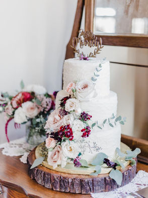
Wedding Colors: How Many to Have and How to Choose Them
Less is more and more is less.
By Rebecca Shell | Posted 11/17/22

color theme sets the overall tone for your wedding. It is one of the first
A
details your guests will notice, what will make your pictures look cohesive, and ultimately gives either a lot of options or very few when it comes to visual details. This is why selecting your colors should be the very first decor-oriented decision you make.
Your color palette should be a reflection of your personality and preferences, but the time of year and venue are essential factors to consider. Are you going for "classy ballroom" with lots of whites and gold? A chic beach wedding with pastels? With all of this to think about, it’s easy to become overwhelmed. But don’t worry, experts have provided us with a rule of thumb-keep your palette to between three and five colors. Anything more than that can start to look confusing and disjointed.
How do you even begin to decide between three
and five colors when there are countless options to choose from, you ask? Start with one or two selections that will act as your main hues, then select one or two secondary colors to add depth (one should be a neutral to work as an anchor and tie everything together). From there, you can add some shine by incorporating gold or silver to use sparingly throughout your decor.
Keep in mind not all color combinations look good together, so you can't always just pick your favorites and hope they blend. To make things easier, the team at Weddings and Events by Vivian compiled a list of some of their favorite seasons/color combinations.
Fall
Fall is arguably the most beautiful season of the year. The naturally occurring colors of the falling leaves, harvested crops, and moody skies provide no shortage of inspiration. Try to reflect the colors of the season with warm tones, such as burnt orange, wine red, and dark cream. Add flecks of gold for sparkle or even brown accents.


Winter
Depending on where you live, the winter season can be a cold one. With a season that brings both harsh, snowy weather and cozy, fireside nights, you can go in a lot of different directions. How about a clean, polished decor to match the icy landscape, or a warm safe haven from the outside elements? If you're going for the latter, experiment with muted tones whilst adding a pop of color, like deep blue, sage green, cream, and burgundy. You can even throw some metallics into your palette, like silver


Spring
Spring represents new growth and a fresh perspective. Your colors should reflect that, so play with some pastel tones. Light pink and fuchsia work great for main hues, then tie them together with hunter green and a neutral, like taupe. Remember, you can also use varying shades of these colors to go as dark or as light as you want.


Summer
This season is full of naturally vibrant colors from beautiful flowers growing all around. Choose decor hues that are youthful and vibrant (such as pastel yellow and dusty blue), bring in a third that packs a punch (a royal purple), and top it off with a neutral that will anchor your palette.


